css动画
时间:2022-04-11 14:44
1:2d.3d转换
代码:


<!DOCTYPE html>
<html>
<head lang="en">
<meta charset="UTF-8">
<title>2d.3d转换</title>
<style>
div{
width: 100px;
height: 100px;
background-color:yellow ;
font-family:cursive;
border-radius: 20px;
opacity: 0.8;
}
.div2{
transform: translate(200px,100px);
-ms-transform: translate(200px,100px); /* IE 9 */
-webkit-transform: translate(200px,100px); /* Safari and Chrome */
-o-transform: translate(200px,100px); /* Opera */
-moz-transform: translate(200px,100px); /* Firefox */
}
.div3
{
transform: rotate(30deg);
-ms-transform: rotate(30deg); /* IE 9 */
-webkit-transform: rotate(30deg); /* Safari and Chrome */
-o-transform: rotate(30deg); /* Opera */
-moz-transform: rotate(30deg); /* Firefox */
}
.div4
{
transform: scale(0.4,0.5);
-ms-transform: scale(0.4,0.5); /* IE 9 */
-webkit-transform: scale(0.4,0.5); /* Safari 和 Chrome */
-o-transform: scale(0.4,0.5); /* Opera */
-moz-transform: scale(0.4,0.5); /* Firefox */
}
.div5
{
transform: skew(30deg,20deg);
-ms-transform: skew(30deg,20deg); /* IE 9 */
-webkit-transform: skew(30deg,20deg); /* Safari and Chrome */
-o-transform: skew(30deg,20deg); /* Opera */
-moz-transform: skew(30deg,20deg); /* Firefox */
}
</style>
</head>
<body>
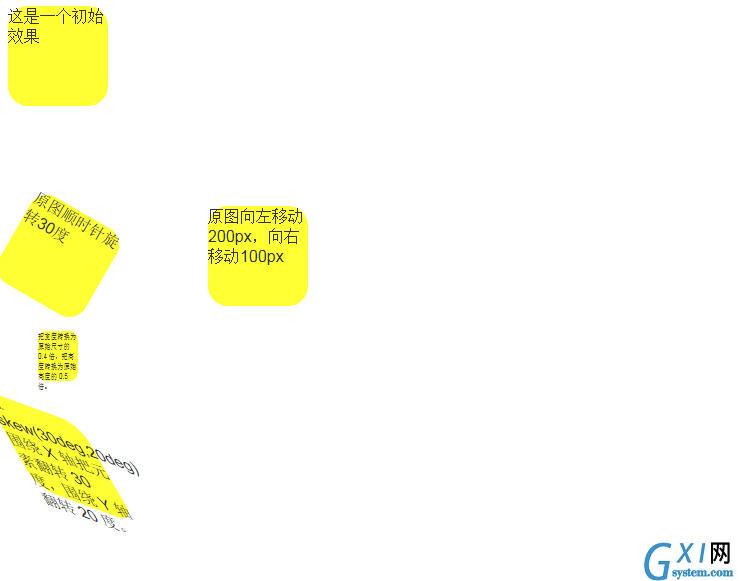
<div>
这是一个初始效果
</div>
<div class="div2">
原图向左移动200px,向右移动100px
</div>
<div class="div3">
原图顺时针旋转30度
</div>
<div class="div4">
把宽度转换为原始尺寸的 0.4 倍,把高度转换为原始高度的 0.5 倍。
</div>
<div class="div5">
值 skew(30deg,20deg) 围绕 X 轴把元素翻转 30 度,围绕 Y 轴翻转 20 度。
</div>
</body>
</html>
View Code
2:过渡:
<!DOCTYPE html>
<html>
<head lang="en">
<meta charset="UTF-8">
<title></title>
<style>
div{
width: 100px;
height: 100px;
background-color:yellow ;
font-family:华文楷体;
border-radius: 20px;
opacity: 0.8;
-moz-transsition: width 2s,height 2s,color 2s,-moz-transform 2s ; /* Firefox */
transition:width 2s,height 2s,color 2s,transform 2s;
transition-delay:1s;/*执行前先要等待1秒*/
}
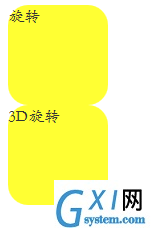
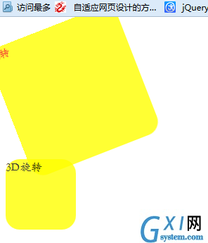
div:hover{
width:200px;
height: 200px;
color: red;
transform: rotate(360deg);
-moz-transform: rotate(360deg);
}
#div2:hover
{
-moz-transform: skew(360deg,360deg); /* Firefox */
}
</style>
</head>
<body>
<div>旋转</div>
<div id="div2">3D旋转</div>
</body>
</html>
View Code
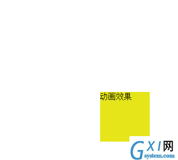
3:动画
<!DOCTYPE html>
<html>
<head lang="en">
<meta charset="UTF-8">
<title></title>
<style>
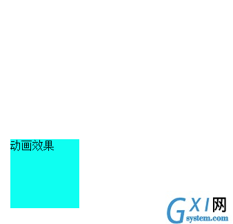
div{
width:100px;
height: 100px;
background-color: red;
position: relative;
animation:5s infinite alternate;/*infinite alternate可以使动画不间断执行*/
-moz-animation:anim 5s infinite alternate; /*火狐浏览器*/
}
/*css代码需要遵循@keyframes规则*/
@keyframes anim{
0%{background-color: red;left: 0px; top: 0px;}
25%{background-color: blue;left: 200px; top: 0px;}
50%{background-color: yellow;left: 200px; top: 200px;}
75%{background-color: #00ffff;left: 0px; top: 200px;}
100%{background-color: #00ffff;left: 0px; top: 0px;}
}
@-moz-keyframes anim{
0%{background-color: red;left: 0px; top: 0px;}
25%{background-color: blue;left: 200px; top: 0px;}
50%{background-color: yellow;left: 200px; top: 200px;}
75%{background-color: #00ffff;left: 0px; top: 200px;}
100%{background-color: #00ffff;left: 0px; top: 0px;}
}
</style>
</head>
<body>
<div>动画效果</div>
</body>
</html>
View Code
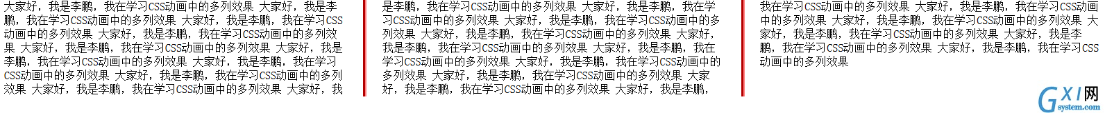
4:自动分列
<!DOCTYPE html>
<html>
<head lang="en">
    <meta charset="UTF-8">
    <title></title>
    <style>
       .div1{
           column-count:3;/*列的数量*/
           -moz-column-count:3;/*适配火狐浏览器*/
           column-gap:50px;
           -moz-column-gap:50px;
           column-rule:5px outset #ff0000;
           -moz-column-rule:5px outset #ff0000;


       }
    </style>
</head>
<body>
    <div class="div1">
        大家好,我是李鹏,我在学习CSS动画中的多列效果
        大家好,我是李鹏,我在学习CSS动画中的多列效果
        大家好,我是李鹏,我在学习CSS动画中的多列效果
        大家好,我是李鹏,我在学习CSS动画中的多列效果
        大家好,我是李鹏,我在学习CSS动画中的多列效果
        大家好,我是李鹏,我在学习CSS动画中的多列效果
        大家好,我是李鹏,我在学习CSS动画中的多列效果
        大家好,我是李鹏,我在学习CSS动画中的多列效果
        大家好,我是李鹏,我在学习CSS动画中的多列效果
        大家好,我是李鹏,我在学习CSS动画中的多列效果
        大家好,我是李鹏,我在学习CSS动画中的多列效果
        大家好,我是李鹏,我在学习CSS动画中的多列效果
        大家好,我是李鹏,我在学习CSS动画中的多列效果
        大家好,我是李鹏,我在学习CSS动画中的多列效果
        大家好,我是李鹏,我在学习CSS动画中的多列效果
        大家好,我是李鹏,我在学习CSS动画中的多列效果
        大家好,我是李鹏,我在学习CSS动画中的多列效果
        大家好,我是李鹏,我在学习CSS动画中的多列效果
        大家好,我是李鹏,我在学习CSS动画中的多列效果
        大家好,我是李鹏,我在学习CSS动画中的多列效果
        大家好,我是李鹏,我在学习CSS动画中的多列效果
        大家好,我是李鹏,我在学习CSS动画中的多列效果
        大家好,我是李鹏,我在学习CSS动画中的多列效果
        大家好,我是李鹏,我在学习CSS动画中的多列效果

    </div>
</body>
</html>
View Code
5:简单的瀑布流