Balloon Slider 进度条
时间:2019-10-16 16:35
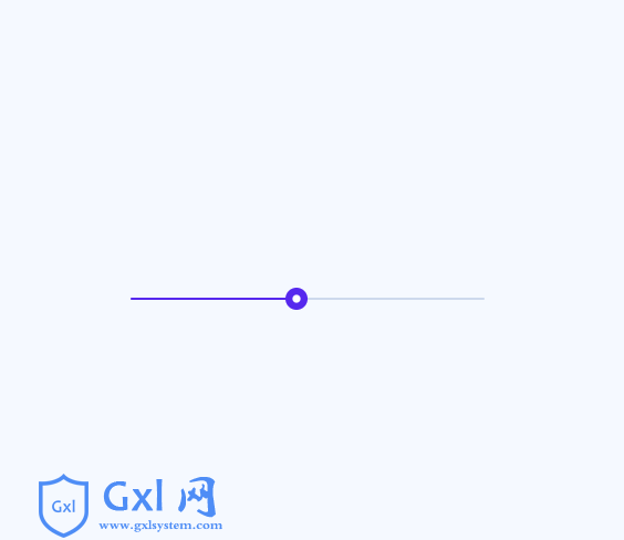
HTML代码 CSS代码 #slider { --active: #5628EE; --balloon: var(--active); --value: #fff; --line: #CDD9ED; touch-action: none; user-select: none; width: 320px; height: 2px; border-radius: 1px; background: var(--line); position: relative; .noUi-connects { .noUi-connect { background: var(--active); } } .noUi-handle { &:before, &:after { border-radius: 20px; transform: scale(var(--s)); transition: transform .3s ease, border-radius .3s ease; } &:before { --s: .5; background: var(--active); } &:after { --s: .2; background: #fff; } &.noUi-active { &:before { --s: 1; } &:after { --s: 1; } } } .balloon { --o: 0; --s: 0; --y: 0; --r: 0deg; width: 52px; height: 68px; pointer-events: none; position: absolute; z-index: 5; left: -26px; bottom: 0; transform-origin: 50% 100%; & > div { width: 52px; height: 68px; transform-origin: 50% 100%; opacity: var(--o); transform: scale(var(--s)) translate(0, var(--y)) rotate(var(--r)); transition: transform .4s ease, opacity .4s ease; &:before, &:after { content: ''; display: block; } &:before { width: 52px; height: 52px; border-radius: 60%; border-bottom-left-radius: 480%; border-bottom-right-radius: 480%; border-top-left-radius: 480%; transform: rotate(135deg); background: var(--balloon); } &:after { content: attr(data-value); font-family: 'Roboto', Arial; font-size: 14px; font-weight: 500; color: var(--value); position: absolute; left: 0; right: 0; top: 16px; line-height: 24px; text-align: center; } svg { display: block; width: 8px; height: 6px; fill: var(--balloon); position: absolute; left: 22px; bottom: 0; } } &.active { --o: 1; --s: 1; --y: -36px; } } // Structure * { touch-action: none; user-select: none; -webkit-tap-highlight-color: transparent; } &.noUi-state-tap .noUi-connect, &.noUi-state-tap .noUi-origin { transition: transform .3s; } .noUi-target { position: relative; } .noUi-base, .noUi-connects { position: relative; z-index: 1; width: 100%; height: 100%; } .noUi-origin, .noUi-connect { position: absolute; will-change: transform; transform-origin: 0 0; top: 0; left: 0; z-index: 1; } .noUi-connects { overflow: hidden; z-index: 0; border-radius: 1px; .noUi-connect { width: 100%; height: 100%; } } .noUi-handle { backface-visibility: hidden; position: absolute; outline: none; cursor: pointer; width: 40px; height: 40px; left: 12px; top: -19px; &:before, &:after { content: ''; position: absolute; } &:before { left: 0; top: 0; width: 40px; height: 40px; } &:after { left: 2px; top: 2px; width: 36px; height: 36px; } } .noUi-origin { left: auto; right: 0; height: 0; width: 10%; } } html { box-sizing: border-box; -webkit-font-smoothing: antialiased; } * { box-sizing: inherit; &:before, &:after { box-sizing: inherit; } } // Center & dribbble body { min-height: 100vh; display: flex; font-family: 'Roboto', Arial; justify-content: center; align-items: center; background: #F5F9FF; .dribbble { position: fixed; display: block; right: 20px; bottom: 20px; img { display: block; height: 28px; } } }
教程排行
- 1uniapp怎么刷新当前页面
- 2uniapp如何禁止页面滑动
- 3html如何设置背景颜色?两种方法教会你
- 4html如何给div加边框
- 5HTML网页自动跳转的5种方法
- 6uniapp如何实现跳转至浏览器
- 7html网页乱码原因以及解决办法
- 8uniapp怎么去掉标题栏
- 9uniapp如何封装request请求
- 10如何解决uniapp icon不显示的问题
- 11uniapp如何设置动态启动页
- 12html表格如何设置间距
- 13命令行如何更新node版本?
- 14怎么用npm安装vue
- 15uniapp如何取消页面滚动条
- 16uniapp如何实现微信授权登录
- 17教你使用ps制作真实水效果(技巧分享)
- 18如何解决uniapp本地图片不显示的问题
- 19vue.js如何循环数组
- 20uniapp如何设置导航栏隐藏显示